
Creating a board book with Pint Size Productions is simple, but there are some things you should keep in mind before you get started. If you would like to see the basics of how to create a board book with us, check out our introductory article here, when you have your project open and ready to make it the best it can be, follow these tips below!
By following these simple tips, you can be assured that your board book comes out looking professional, cohesive, and of course, beautiful!
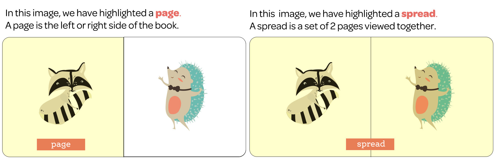
Tip #1: Understand the Difference Between Pages and Spreads, our Board Book Formats, and Trim Specifications
Understand the difference between pages and spreads
The first thing that we find very helpful for users who are seeking to design their own board book using one of our professional templates is understanding the difference between pages and spreads. As seen in the illustration below, a page is a single page in the book. Our board books are made up of reader spreads, which consist of 2 consecutive pages. (What you will see when the book is open.) We offer a variety of formats for your mass production or individual board book. Please note, we are unable to add or subtract pages from our board book templates.
Be mindful of bleed
Wikipedia defines bleed as the printing that goes beyond the edge of where the sheet will be trimmed once printed. In other words, the bleed is the area that will be trimmed off. The bleed is the part on the side of a document that gives the printer a small amount of space to account for the movement of the paper, and design inconsistencies. Artwork and background colors often extend into the bleed area. After trimming, the bleed ensures that no unprinted edges occur in the final trimmed board book.
To ensure you have no unprinted edges, we recommend utilizing full bleed with our board book templates. But, be mindful of important things like people’s heads or faces potentially being cut off.
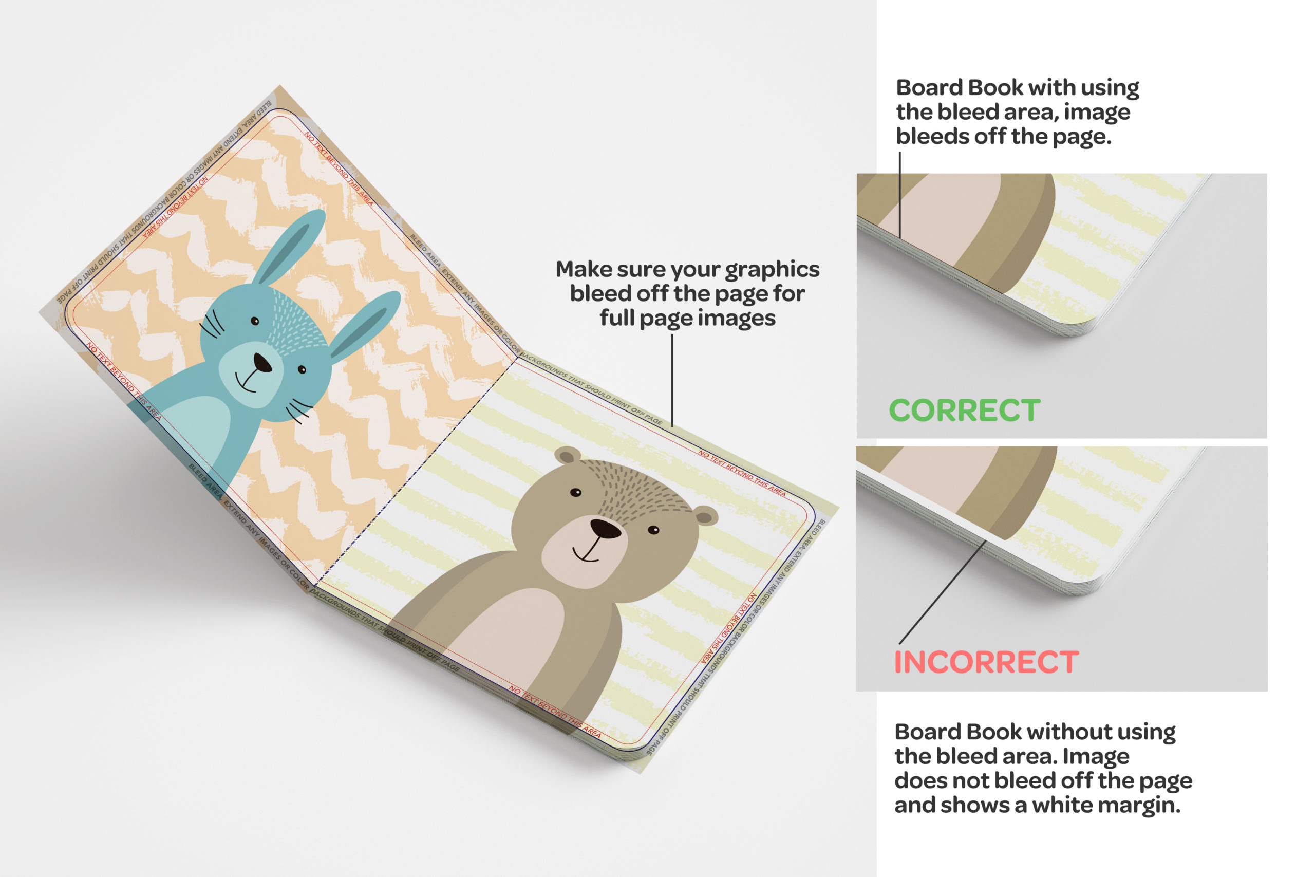
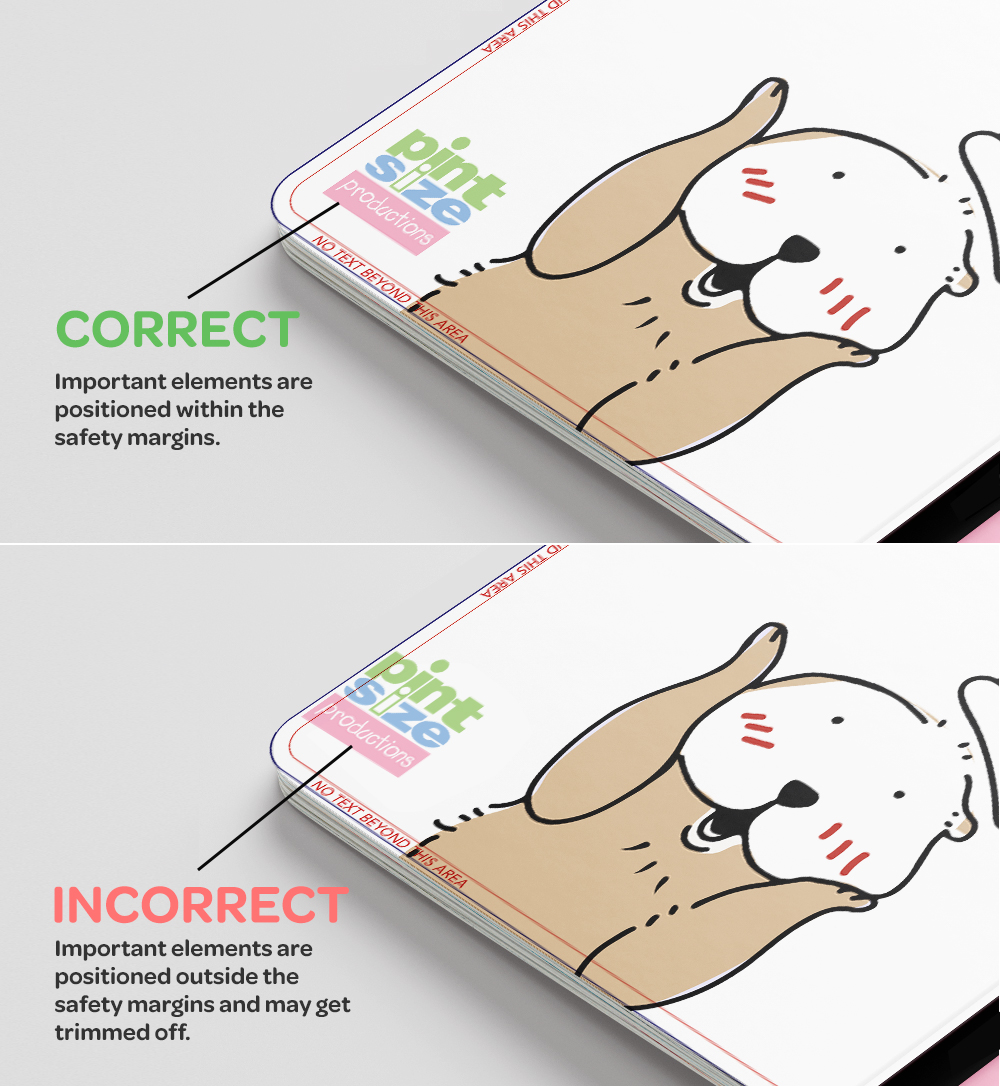
Safety margins matter
The safety margin shown on our template is the area where the important parts of your design should be placed to ensure they don’t get trimmed off due to potential slight variations in the trimming process. Important items like text or logos should be placed within the safety margin to ensure they are not cut off. The safety margin prevents items from being cut off during the trimming process.
Tip #2: Be mindful of design with colors, fonts, and borders
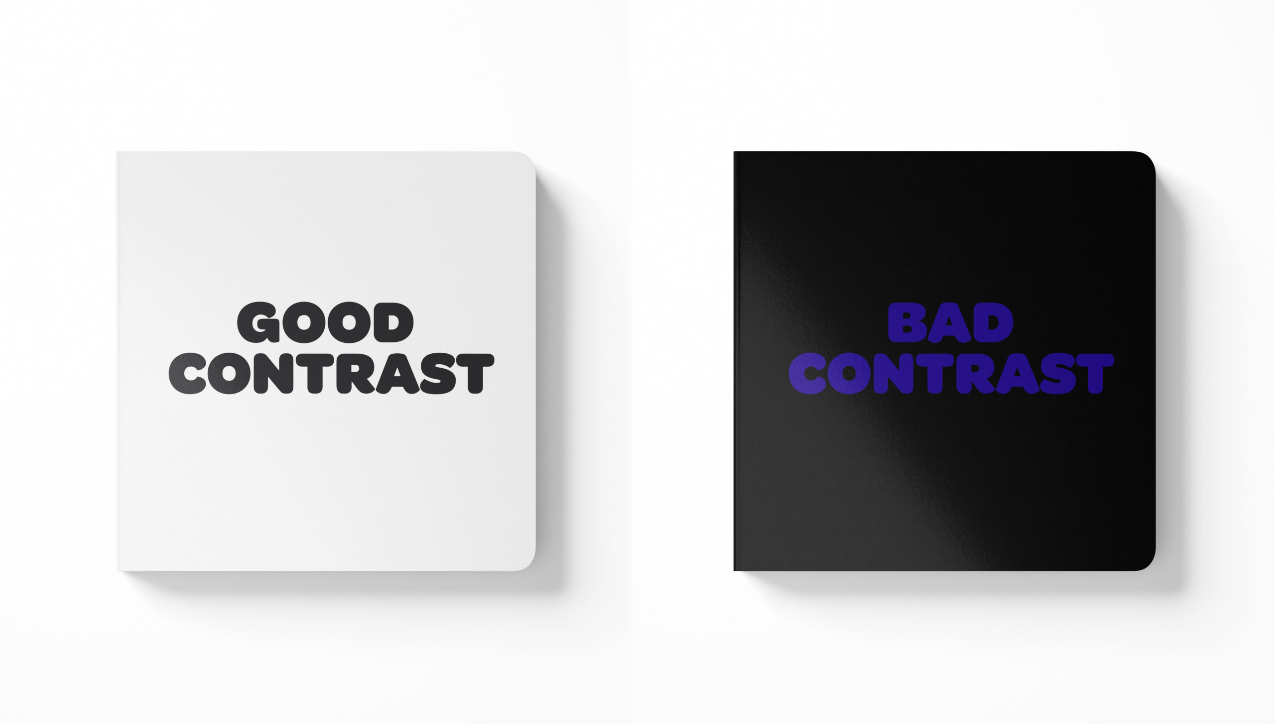
Use a high-contrast color scheme
In design, having contrast that is pleasing to the eye makes all the difference. We recommend following the general rule of dark font colors on light backgrounds or light font colors on dark backgrounds to ensure your colors pop in your board book. We don’t recommend using dark font colors on dark backgrounds as it will likely be harder to read. Depending on the brightness of your screen, colors may appear brighter than the printed outcome – take this into consideration when choosing the right shade!
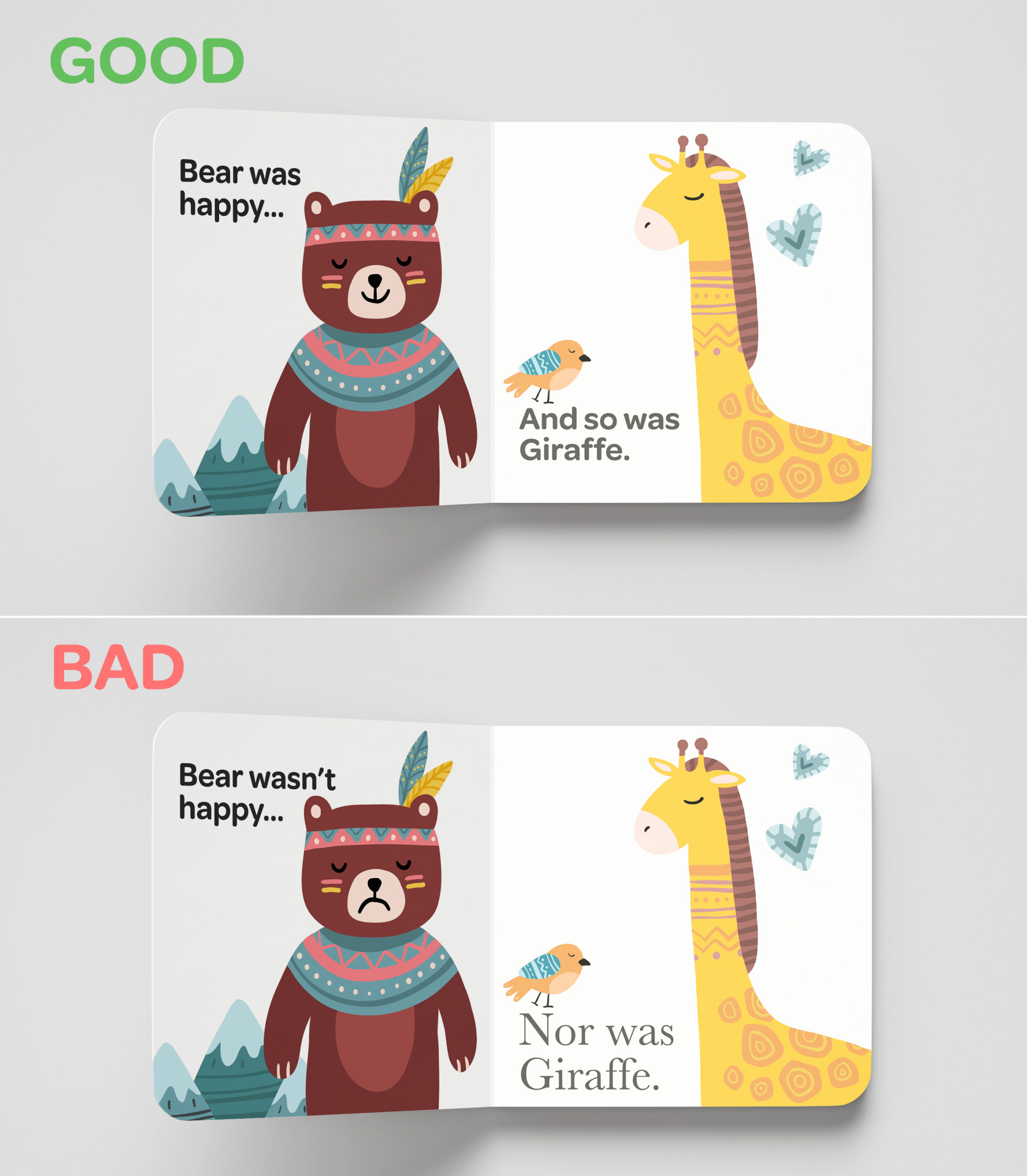
Consistency is key
Choosing a single font, font size, and color scheme to use on each spread will create a professional-looking design that readers can easily follow. Make sure that your font is easy to read, too!
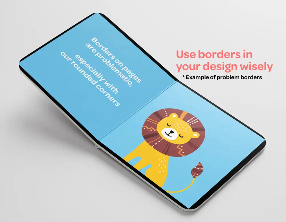
Make sure your borders help, and not hurt your design
Borders can be used to help to emphasize type in the book or photos – as long as they’re used correctly. We don’t recommend using borders in the overall design of your spreads as the slight variation in the trimming process may cause the border to appear off-center. When using borders on your individual photos, be cautious of the margin and bleed area to ensure part of your border isn’t removed in the trimming process.
Tip #3: Get your file print-ready
Choose the correct color mode for print
If you’re designing a board book using one of our advanced board book templates or uploading a PDF spread to a professional board book template, this tip is for you! For the truest colors and best quality print, we recommend providing photos/spreads in CMYK color mode as our printer uses these inks. RGB color mode is meant for digital and web viewing, while CMYK is meant for printing. Using images in RGB color mode may cause your images to appear slightly different when printed.
Make sure your images are 300 dpi
We recommend all images uploaded be at least 300 dpi (dots per inch) or higher. If you’re using an image taken with a smartphone, be sure to use the original image, and not the smaller, compressed versions to get the highest quality result.
Disable or delete die lines on PDF spreads
If you downloaded one of our templates and are uploading your own spreads created outside of our website, please be sure to delete the die line layer before uploading, otherwise, the die lines will print along with your artwork. We will reach out to you if we notice the die lines are still on your art file and place your order on hold until we receive revised versions. This may cause a delay in your order shipment. Please note that the die lines that you see on our online template are for reference only and will not print out.
Use images that you own the rights to
Ensuring that you have the legal rights to use each image uploaded to your board book will help to keep your order running smoothly. We cannot reproduce any images that are from existing books, TV characters, etc. as it breaches copyright laws. We will reach out to you if we feel we cannot produce your book for this reason, and promptly refund you.
Now Go, Create!
Congrats! Now you have all the information you need to create a quality, professional-looking board book. Create away, and we look forward to working with you!
Now let’s go create your board book!